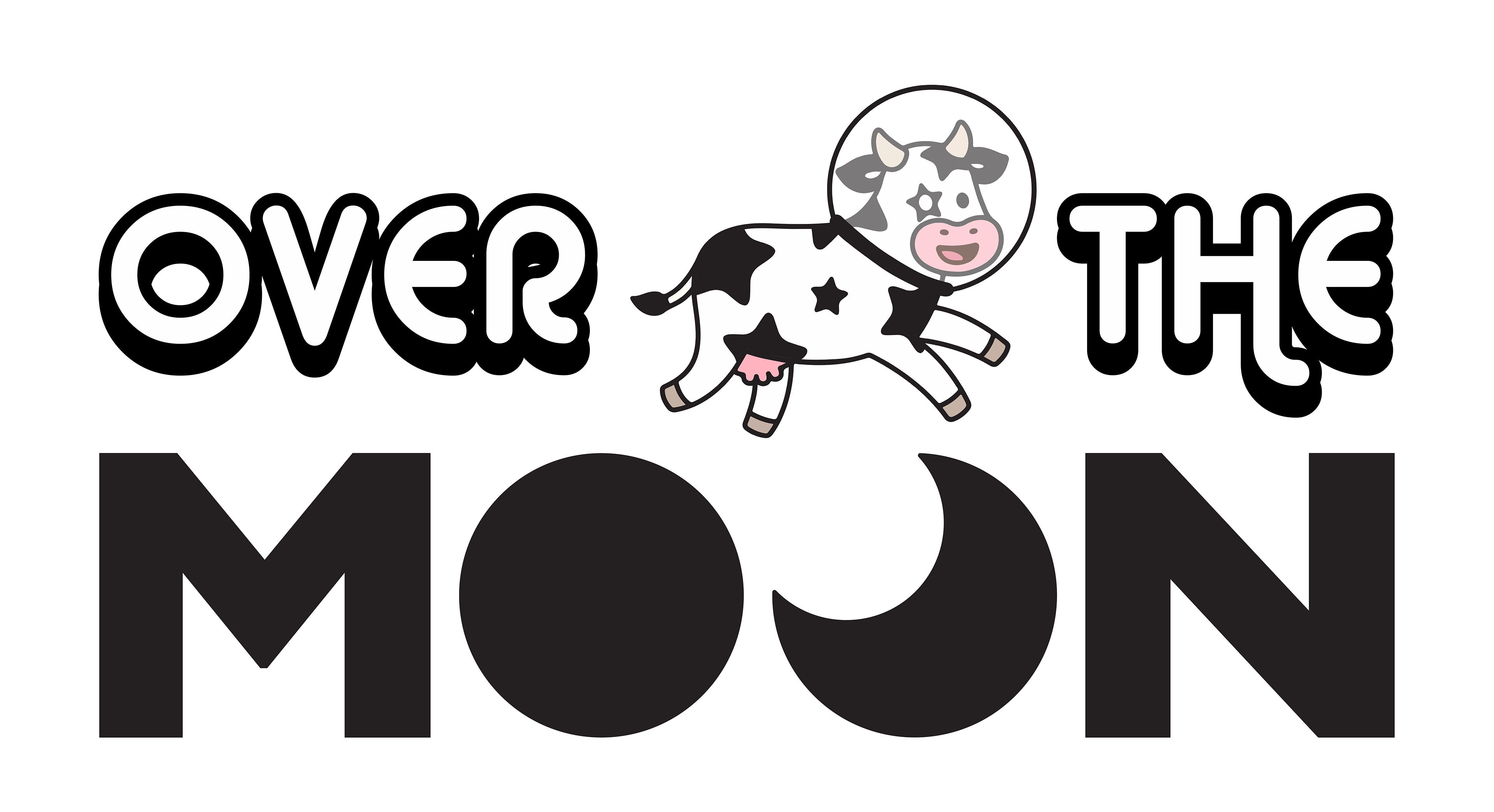
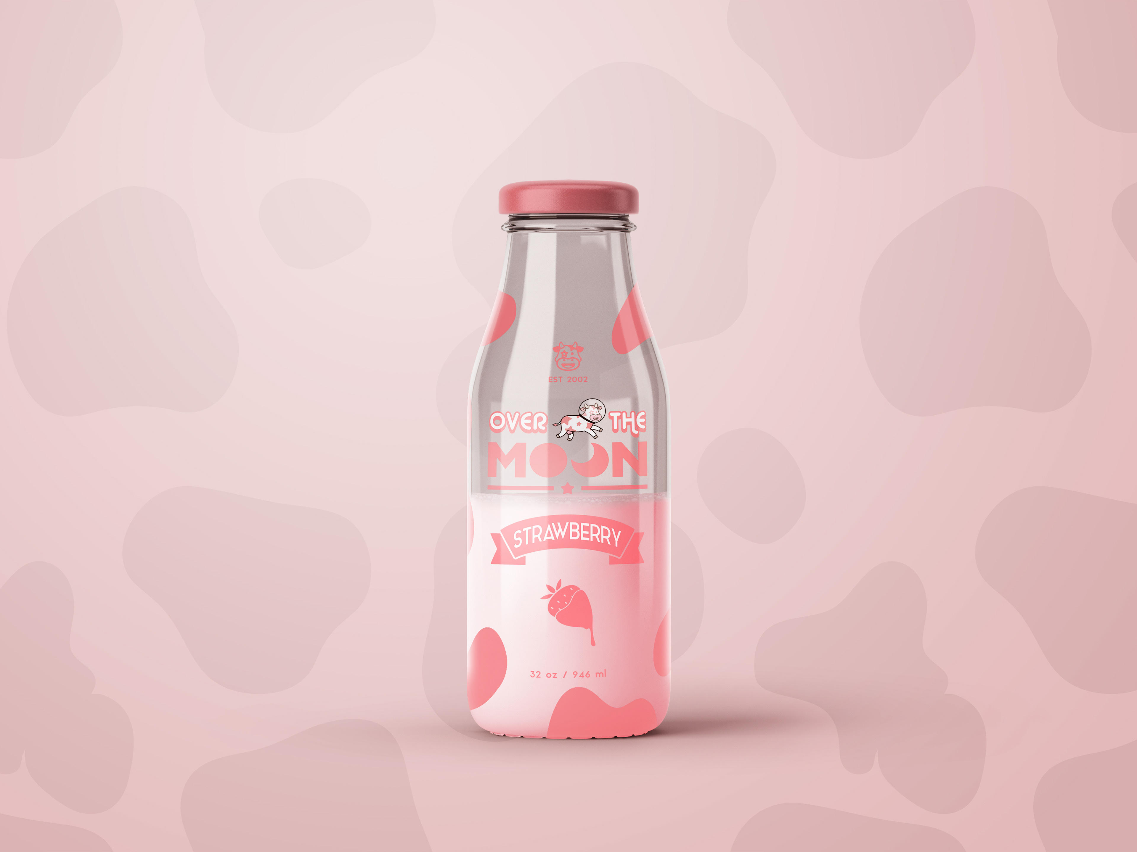
Over the Moon is a playful, nostalgic milk brand inspired by the classic nursery rhyme “Hey Diddle, Diddle.” The name captures the whimsical image of a cow leaping over the moon, which is brought to life through a custom logo featuring a star-speckled cow — affectionately named Cosmoo — jumping between two “O”s representing Earth and the Moon.
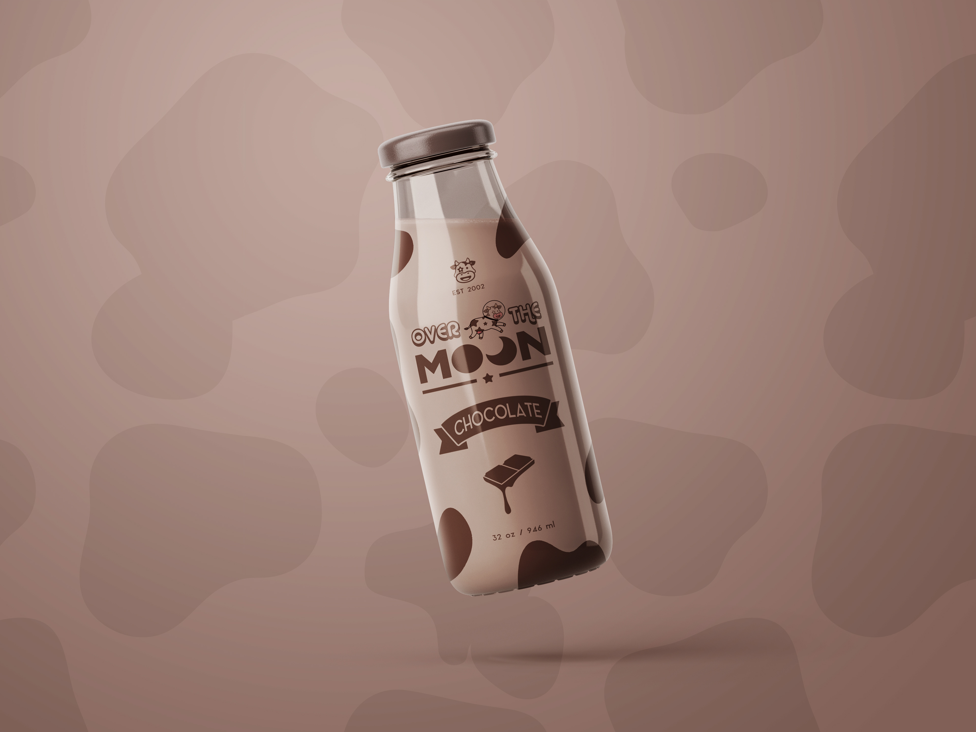
The branding strikes a careful balance between visual charm and modern simplicity, appealing to both children and adults. Packaging is built around retro-inspired glass bottles that nod to the milkman era while enhancing the product’s perceived quality and sustainability. Each flavor is distinguished by a bold, singular color — white for Whole Milk, brown for Chocolate, and pink for Strawberry — keeping the overall design clean and instantly recognizable.
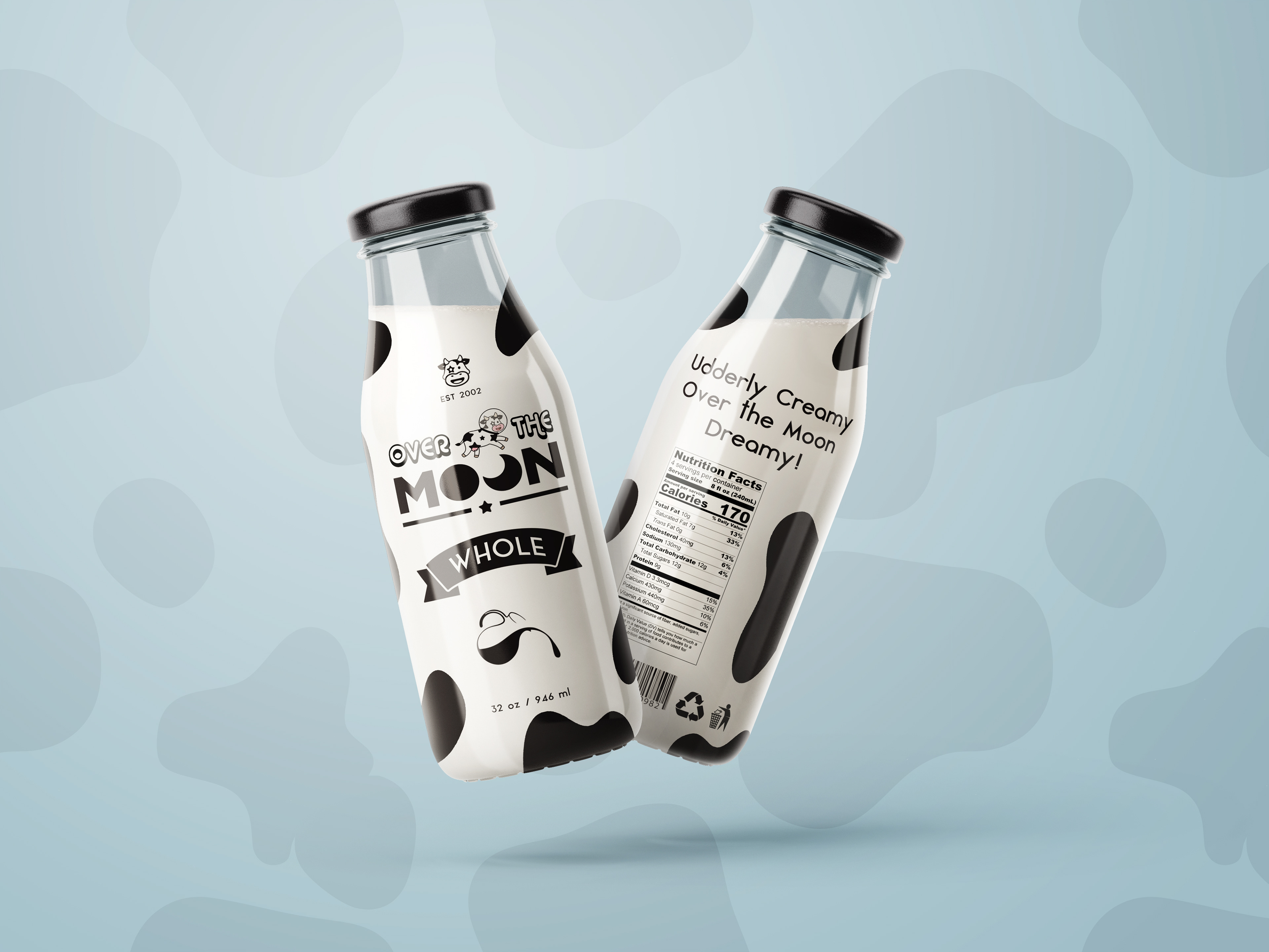
Following feedback from various sources, key refinements were made to improve both the design’s clarity and accessibility. Font sizes were increased and the hierarchy of text elements, such as “over the,” was adjusted to ensure better legibility. The typeface was switched to a more readable style and the color palette was refined to enhance contrast, making the text more accessible for viewers with visual impairments. Additional updates included enlarging the cow icon and fine-tuning typography with more consistent letter spacing, resulting in a cleaner, more cohesive presentation across all packaging.
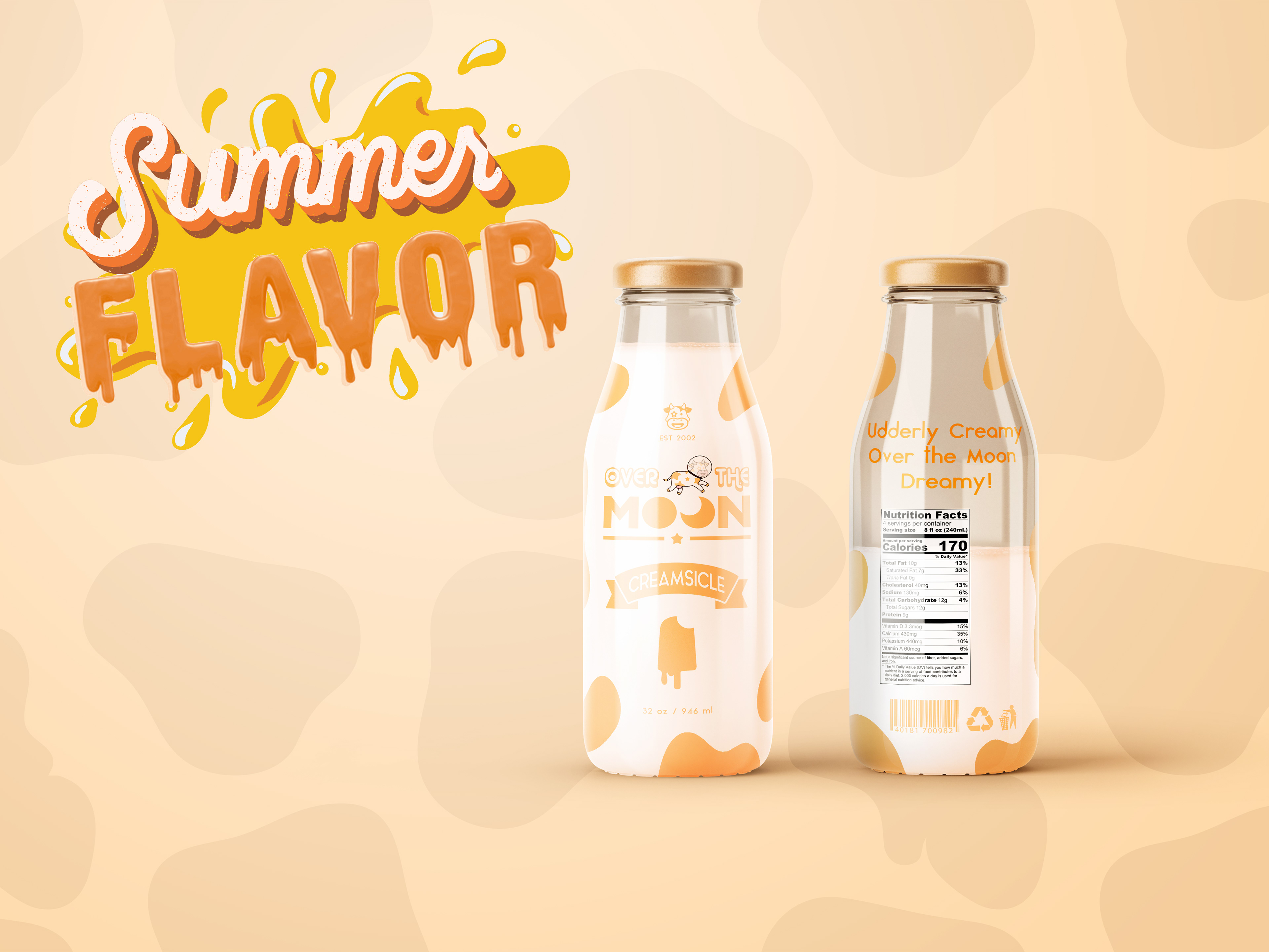
To expand the brand story and keep the concept engaging, a seasonal Orange Creamsicle flavor was introduced. This addition reflects a personal nostalgic connection and brings playful variety to the product line, encouraging continued interest in the brand.