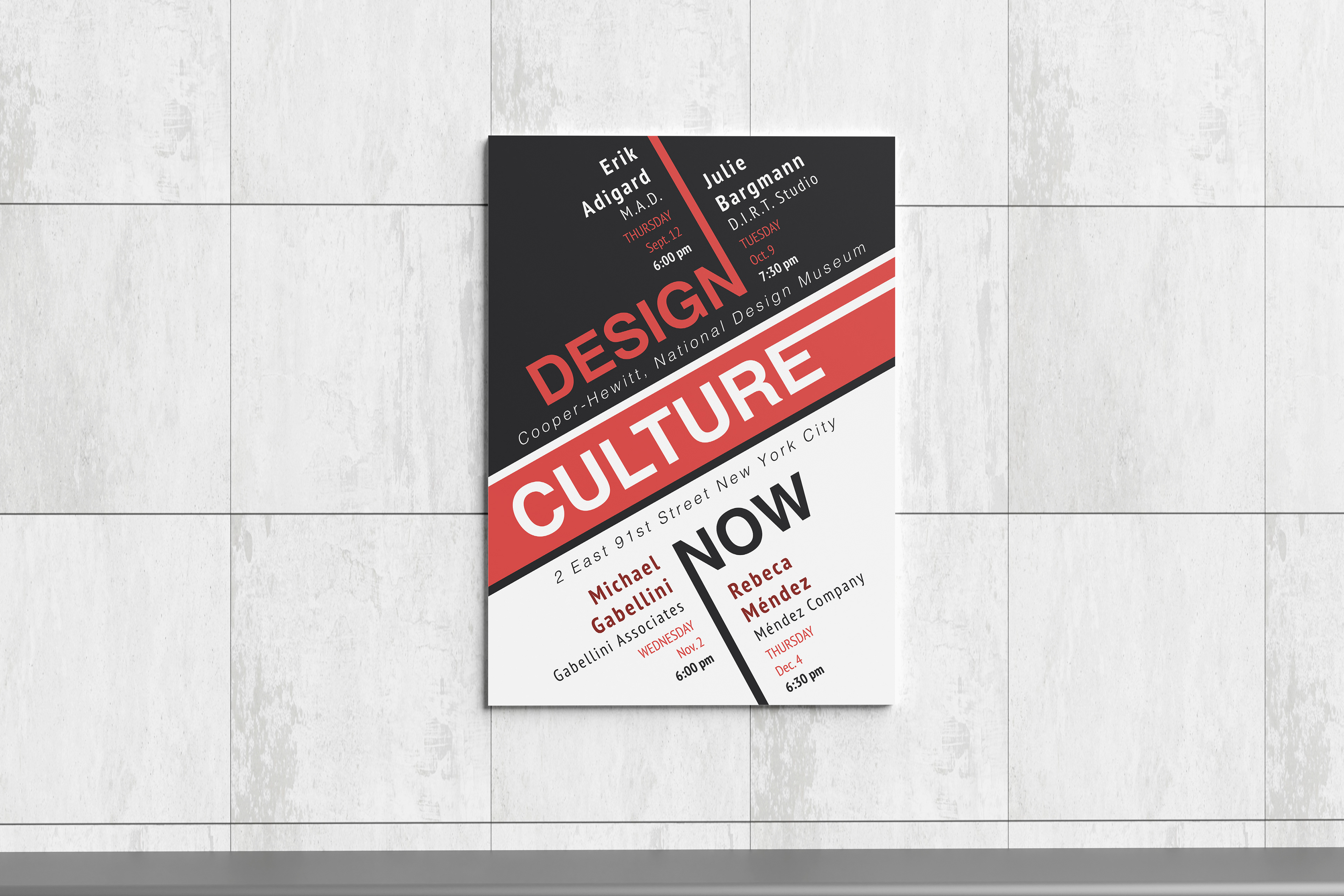
This poster was developed as a conceptual advertisement for an event hosted by the Cooper Hewitt, Smithsonian Design Museum. The challenge was to take a provided body of text and transform it into a visually compelling poster that effectively communicates the event's information.
The design emphasizes sharp, angular elements to create visual structure and hierarchy,
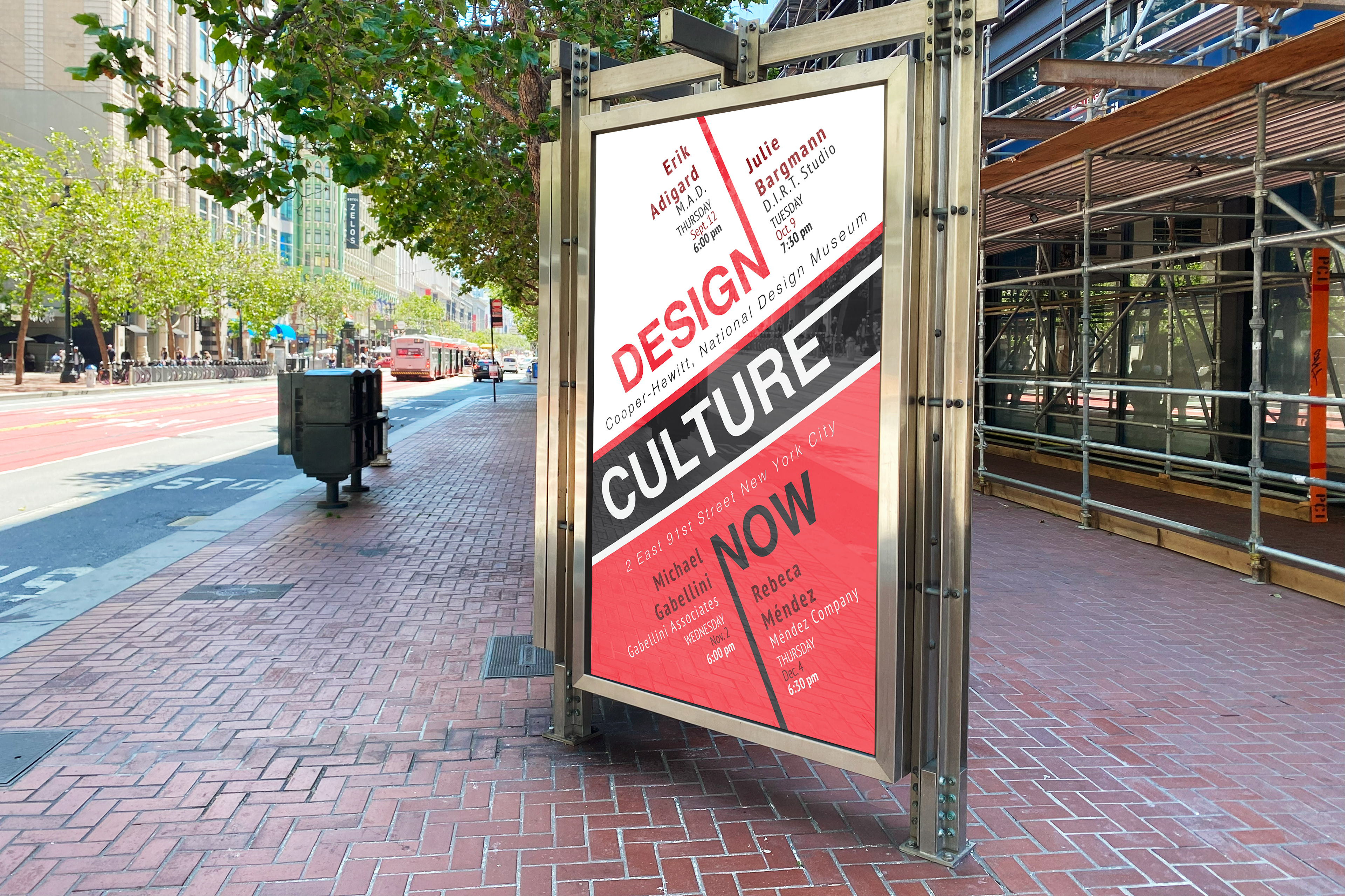
with strategic use of red as the sole accent color alongside black and white. Red was chosen for its proven ability to draw attention, helping key information stand out.
Over the course of refinement, the layout was adjusted for better readability, especially when adapted for larger-scale display in a street kiosk setting. This included removing dense body text that no longer suited a distant viewing context and increasing contrast on key text elements for improved legibility.
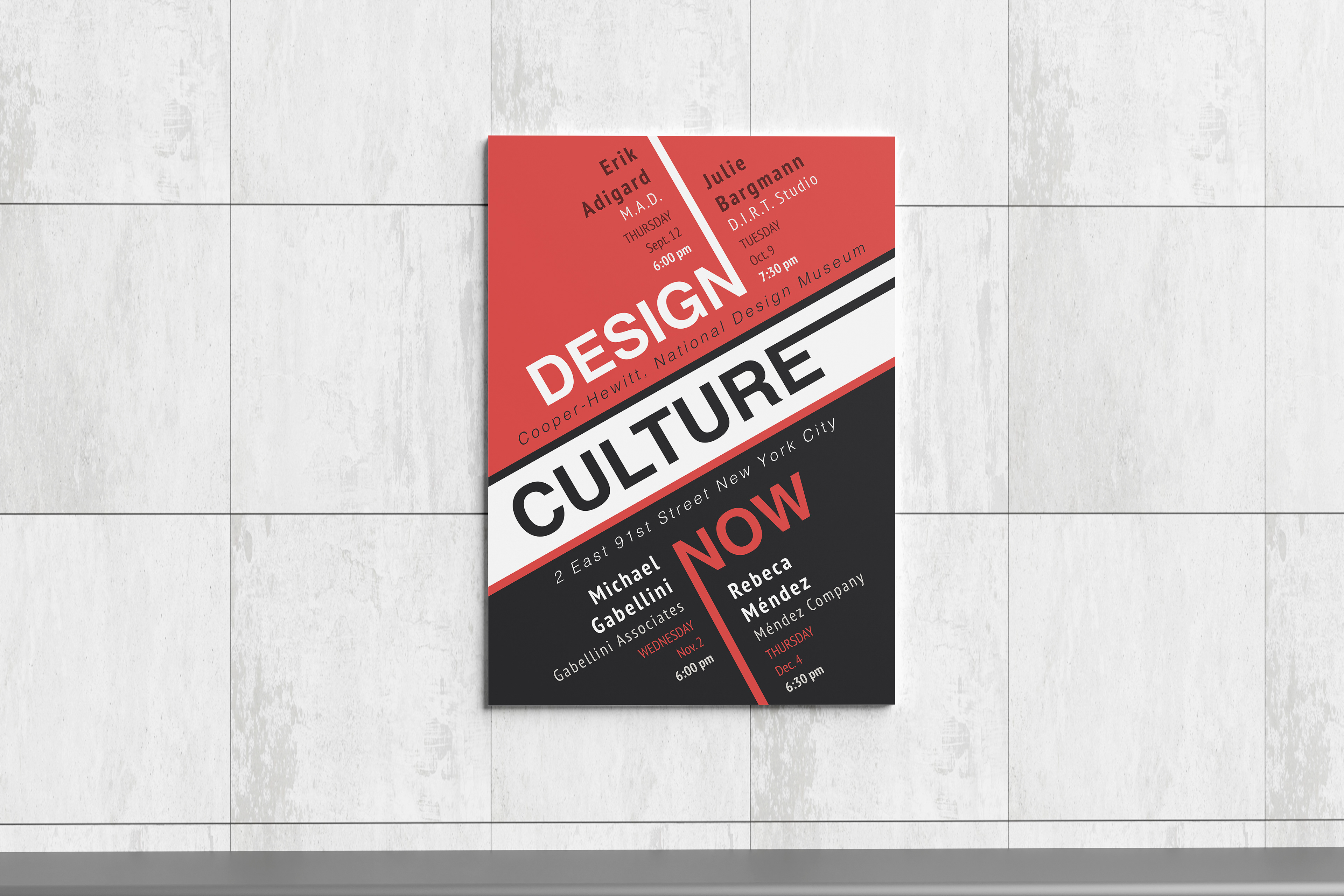
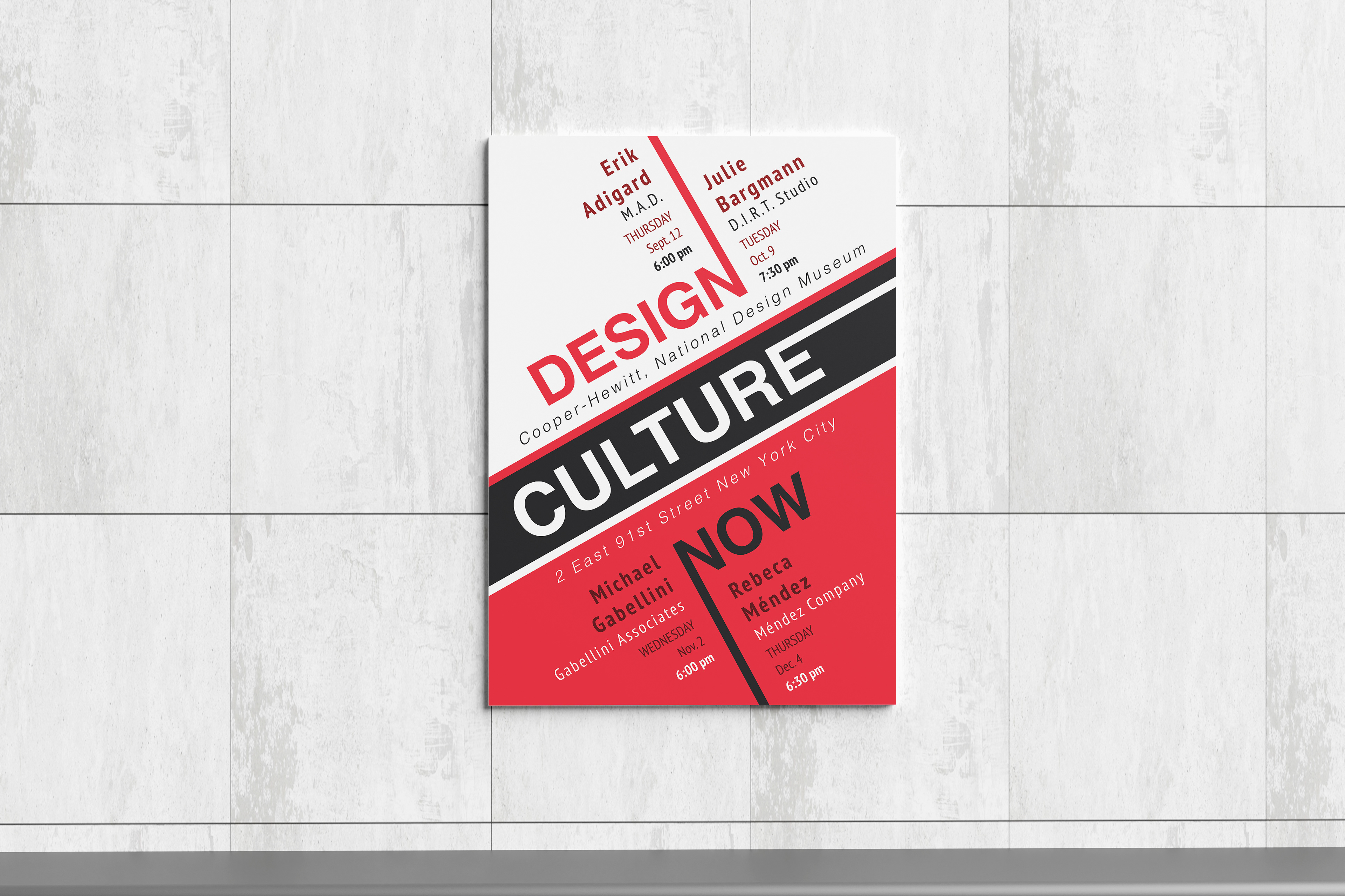
To expand the visual system, the original design was later developed into a series of three posters, each using the same layout and color-limited palette. The series was displayed together to showcase consistency and flexibility across multiple variations.