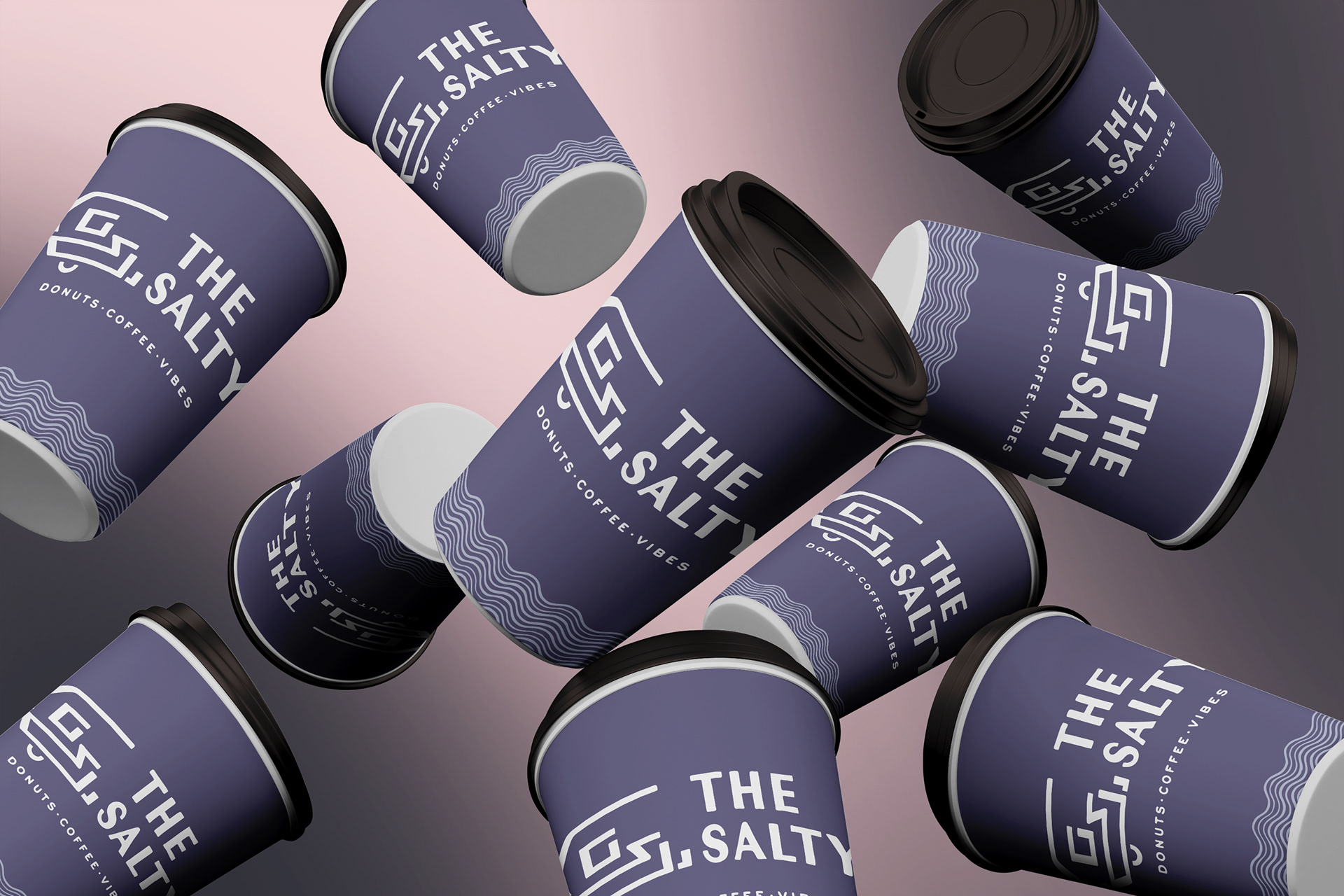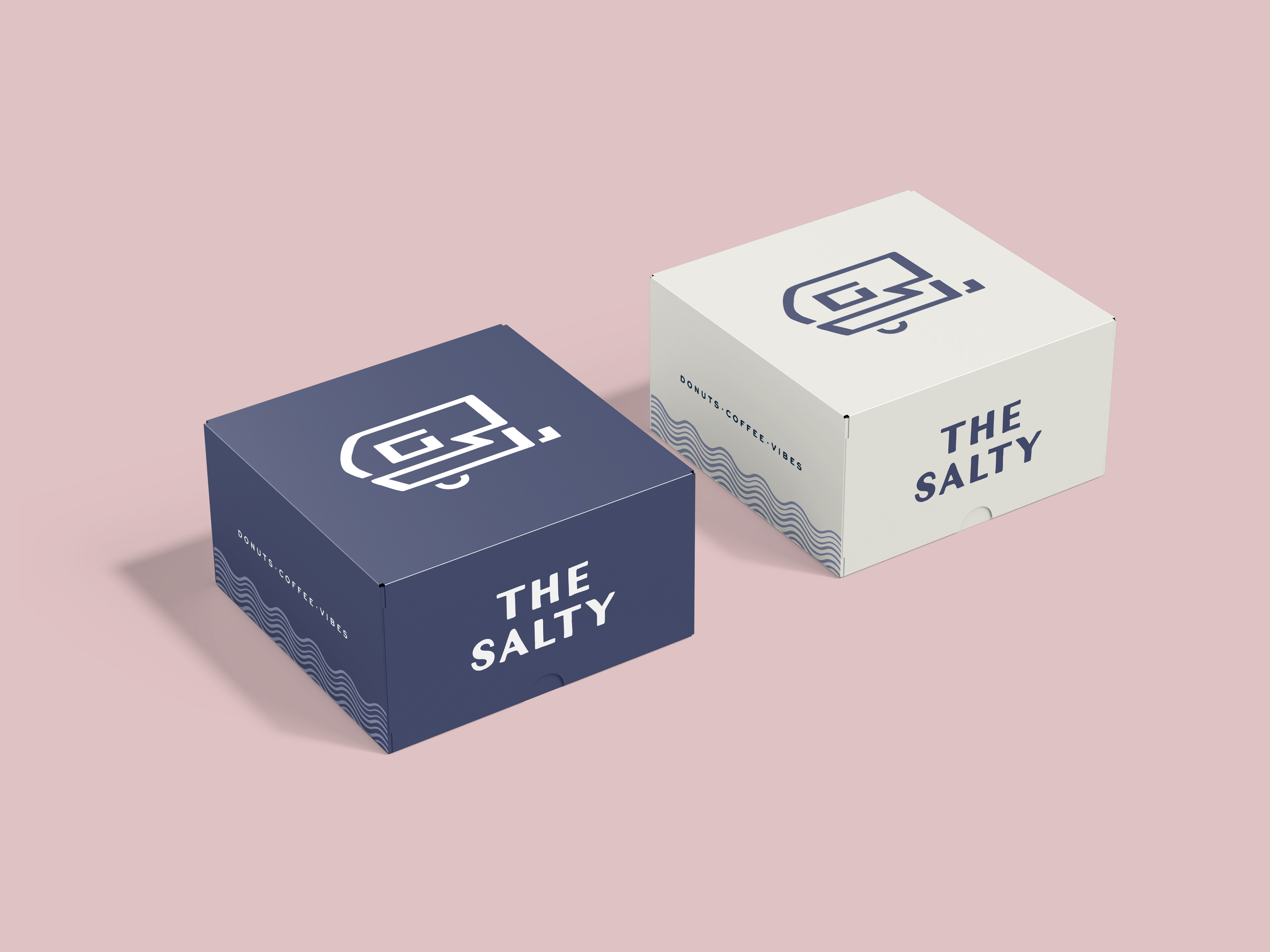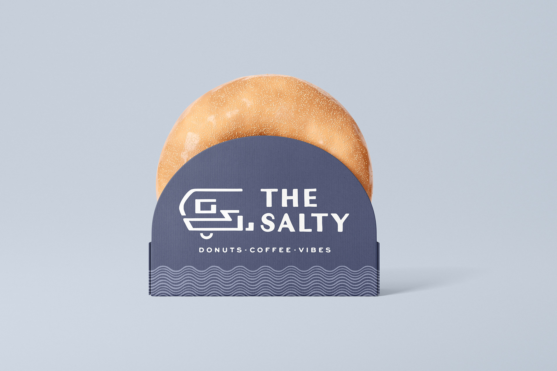


This branding project reimagines the visual identity for The Salty, a donut and coffee shop known for its typographic logo but lacking a distinct brand icon. Having worked at The Salty's Charlotte location, I developed a personal connection to the brand — and saw an opportunity to create an icon that could complement the existing logo while bringing a deeper sense of identity and story to the brand.
Initial ideas centered around donuts and salt, but these felt too generic and disconnected from what makes the brand unique. Digging into The Salty’s origin story, I discovered that the business began in a 1950s Aljoa camper, which served as their first mobile storefront. This detail became the foundation for the logo concept.
The final design features a clean, minimal illustration of the original camper, crafted with line weights and proportions that align with the existing wordmark. The goal was to create an icon that feels like a natural extension of the current branding while offering flexibility across packaging and signage.
This project serves as a brand refresh concept, bridging the company’s roots with its current identity, and proposing a scalable visual system that deepens its story and strengthens its presence.